Brand Logo
2022
The company name is harih, which means "remover of suffering" in Sanskrit.
The harih logo has three words: the first is harih, the second is hair, and the third is air.
The needles, represented by the letter 'h' (hari means needle in Japanese), on both sides of the logo, symbolize our aspiration to remove burdens and bring lightness like air to people's hearts.
The harih logo has three words: the first is harih, the second is hair, and the third is air.
The needles, represented by the letter 'h' (hari means needle in Japanese), on both sides of the logo, symbolize our aspiration to remove burdens and bring lightness like air to people's hearts.


⚫︎
⚫︎
Package design
2023
Hot and Chilly Inner Cap / Packaging design for a mid-layer cap that reduces the burden of heat, cold, stuffiness, etc., when wearing a wig.
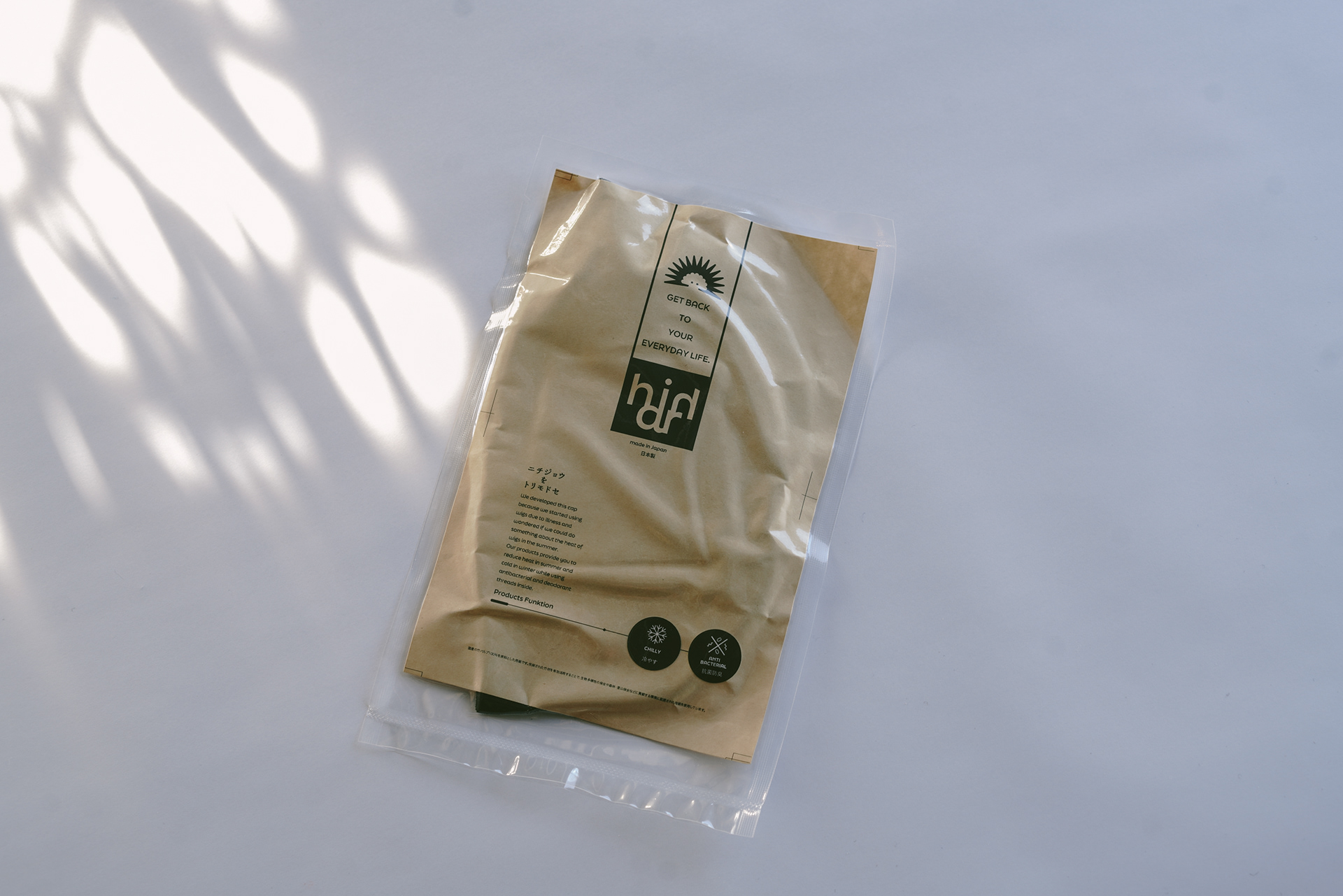

Takeshi Miyamoto: product photography
⚫︎
⚫︎
Illustration
2022
Illustration for the brand book.


Junko Ikeno: Art Direction
Rin Takehiro: Design
Takeshi Miyamoto: Card and product photography